The Frostig School Identity
The Frostig School Identity has been designed to express the core values of the organization. Through the specific use of color, typography, photography, and illustrative elements, the brand elements carefully combine to convey a sense of community where achievement is reached by recognizing and celebrating individuality. The organization and the brand treat every human being with dignity and kindness.
The Frostig School Mission
The Frostig School empowers children with learning differences to reach their highest potential by uncovering and nurturing their unique strengths. By combining professional development with academic research, innovative, multi-disciplinary programs and services, and personalized learning, Frostig offers a safe, supportive and well-rounded education. Together, the faculty, staff and parent body nurtures an environment that celebrates and elevates each student as they travel the path to becoming thriving members of society.
The Logotype |
The Frostig School Logotype is composed of specially designed letterforms in which the letter “T” incorporates a stylized tree. The tree pays homage to the prior Frostig logo. Symbolically, trees represent life, wisdom, power, and prosperity. Our logotype uses the tree branches to be symbolic neural pathways of the human brain, each terminating in a colorful round endpoint that represents the diversity of thinking and connectedness of the greater school community.
Space & SizeTo maintain optimum legibility, a clear space equal to that of the capital “F” must be observed at all times. No other elements (typography, imagery, logos) may appear within the clear space denoted by the gray area seen below. In addition, minimum sizes have been established, whereby the printed logotype may not appear any smaller than 1.25” in width, the minimum size for digital usage is 150 pixels.
Color VariationsWhenever possible, the Frostig School logotype should appear in full color, samples of full-color logos are shown below on light background colors/white and as a reverse for use on dark color backgrounds. Either usage is acceptable as long as careful consideration is made to ensure maximum contrast is maintained. In cases where use of the full-color logotype is not possible or would be impractical the one-color, or one-color reverse version may be used. Again, careful consideration as to maximum contrast should guide your decision on which version to apply. |
FULL COLOR
|
|
FULL COLOR REVERSE |
|
ONE COLOR |
|
ONE COLOR REVERSE |
The Tree IconThe Tree icon is provided for use as a stand-alone illustrative design element. It may never be used in place of the logotype and must never visually compete with the logotype. The Tree icon should never be used more than once on any given piece of communication. When used judiciously, the icon can provide a vibrant, pop of color and form where imagery is not appropriate or available.
|

Respect the Mark |
Maintaining Brand ConsistencyThe Frostig School logotype has been carefully developed for maximum impact and readability. As the core element of the brand, faithful adherence to its use is critical to ensure brand consistency across all mediums. It is therefore never acceptable to recreate, redraw, recolor or distort the logotype in any way. Logotype files are available in the following formats: eps, jpg, and png for use in any physical or digital format. |
| Do not distort the logo by compressing or stretching.
Do not place the logo at an angle. |
|


| Do not add effects to the logo.
Do not change the color of the logo. |
|


| Do not break the logo apart.
Do not change the typeface of the logo. |
|


| Do not place the logo on a background with insufficient contrast.
Do not place the logo on a background that limits legibility. |
|

Our Typefaces |
A consistent message starts with the right fontsFonts do more than simply convey the written word when they are used in a thoughtful and consistent manner—they create a sense of personality and tone to all Frostig School communications. The fonts shown below have been carefully selected for legibility across all mediums and to create a unique and ownable look and feel, even in cases where imagery and color may be absent, the paring of these fonts immediately projects our Frostig School brand. Primary Headline FontThe primary headline font for all Frostig School communications is Playfair Display Regular—available free of charge as a Google Font. Playfair Display is also recommended to use on subheads and large pull quotes, as seen above. This is Playfair Display Regular. Primary Body Copy FontThe primary body copy font for all Frostig School communications is Cormorant Garamond Semibold—available free of charge as a Google Font. This font is recommended for copy that will appear at 9 pt. or above. In cases where a smaller point size is needed, you should consider the use of the secondary body copy font, Cabin Regular or Cabin Bold (see below). This is Cormorant Garamond Semibold. Secondary Body Copy FontThe secondary body copy fonts for all Frostig School communications are Cabin Regular and Cabin Bold—available free of charge as a Google Font. These two san serif fonts are particularly legible in smaller sizes, but can be used wherever a change of font can help separate content or call attention to elements like callouts or captions. This is Cabin Regular. Alternate TypefacesWhen the primary and secondary typefaces are not available or impractical to use, the following system fonts may be used. These fonts are widely available within the fonts included on both PC and Mac systems. It is strongly recommended that you make every possible effort to use the primary typefaces before resorting to these alternates. Times Regular and Bold should be used in place of Playfair and Cormorant Garamond Semibold, while Tahoma Regular and Bold is appropriate in place of Cabin Regular and Cabin Bold. This is Times Regular. This is Tahoma Regular. |
Our Color Palette |
Color helps tell the Frostig School StoryThe Frostig School color palette consists of ten colors that project the warmth, vibrancy and diversity of the school and community. This rich palette provides a wealth of combinations to help communicate any feeling, mood, or situation. It is advisable to limit your palette on any communication to under five colors, using one or two most predominately, with others as accents. The pattern on the top of this page provides a good example of the selective use of color.
|

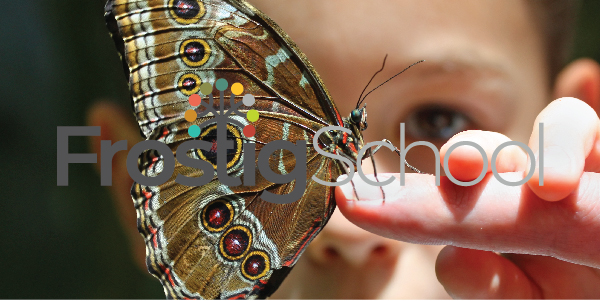
Our School imagery |
Imagery that conveys authenticityImagery powerfully conveys a wide array of emotions when attention is paid to the photographic subject, format, and style. Whenever possible, stay away from staged, static, posed shots, instead opting for shots that are “caught in the moment”. Pay attention to framing the subject and using a variety of wide, medium, and close-up shots to help create texture and interest. Full Color PhotographyColor photographs engage the viewer and project a strong sense of time and space. Select your strongest photographs for color usage whenever possible.
|


DuotonesCreating duotones is the process of using a grayscale (black and white) photo with a wash of color. This process can enhance images and create more interest in photos that are not optimum in quality (think snapshots, non-professional images and low resolution shots).
|


Pattern |
Connecting DotsThe “Connecting Dots” pattern has been specially designed exclusively for the Frostig School brand. The pattern is available in 8 different color combinations for use as a background element in place of either photograpy, or a solid color. Care should be used when the pattern is used in conjunction with typography to ensure readability is always the paramount consideration.
|